
Skio
Designing a Loyalty & Membership ecosystem from 0 ➔ 1 to expand Skio’s product offering beyond subscription management and strengthen merchant commitment to Skio’s platform.
Role
Sole Product Designer
Timeline
March 2024 - Q3 2024 launch
Discipline
UI/UX Design, Design Systems,
User Research, Web Design
Tools
Figma, Linear, Cycle
Platforms (Desktop + Mobile)
Skio’s Merchant Dashboard
Merchants’ Shopify Sites
Customer Portal (end user)
Team
Andrew Chen (CTO)
Harris Carney (Product Lead)
Arvin Rezvanpour (Software engineer)
Matt Davison (Software engineer)
Overview
As the sole designer, I collaborated with 3 engineers and 1 product manager to build a Loyalty & Membership ecosystem that spans across 3 platforms and interfaces with two types of users: our e-commerce merchants and their customers.
With this new suite of features, our merchants can customize membership tiers for their brand with detailed rewards, credits, and requirements. They can make edits on an individual level through a new Customer Profile feature, as well as personalize a Memberships page on their e-commerce site with versatile templates. Lastly, end users can view and edit their membership information through a gamified customer portal that incentivizes brand loyalty.
Background & Strategic Fit
Why expand to Loyalty from subscriptions?
We chose to expand our product offering in the direction of Loyalty because we noticed there has been a competitive trend of integrating loyalty programs into subscription services, yet we found there was a crucial element lacking within the current market. While current models allow for the redemption of loyalty rewards towards subscriptions, they miss out on incorporating engaging elements like loss aversion strategies and gamification, which can significantly boost subscription sales.
As such, our version of Loyalty & Memberships is aimed at not only enhancing merchant brand loyalty and increasing revenue but also at strengthening merchant commitment to our platform, by integrating with their subscription ecosystem and removing their need to rely on a separate technical product. Additionally, we put a lot of thought into targeting merchants’ needs for customization and empowering them to set up their program exactly the way they want it (branding, program configuration, and all the fun details).
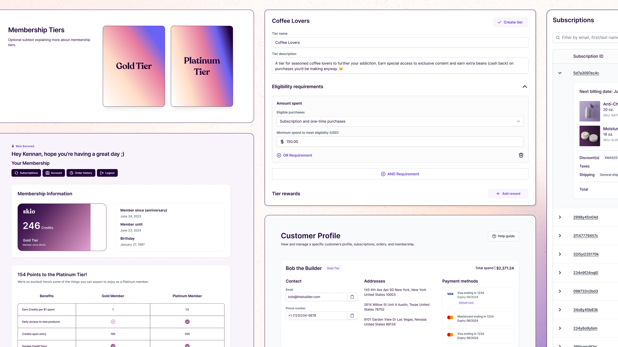
Project Touchpoints
To further elaborate on the different platforms for this project, here is a summary of the key flows for this feature and how they are distributed across our merchant-facing and end-user-facing interfaces.

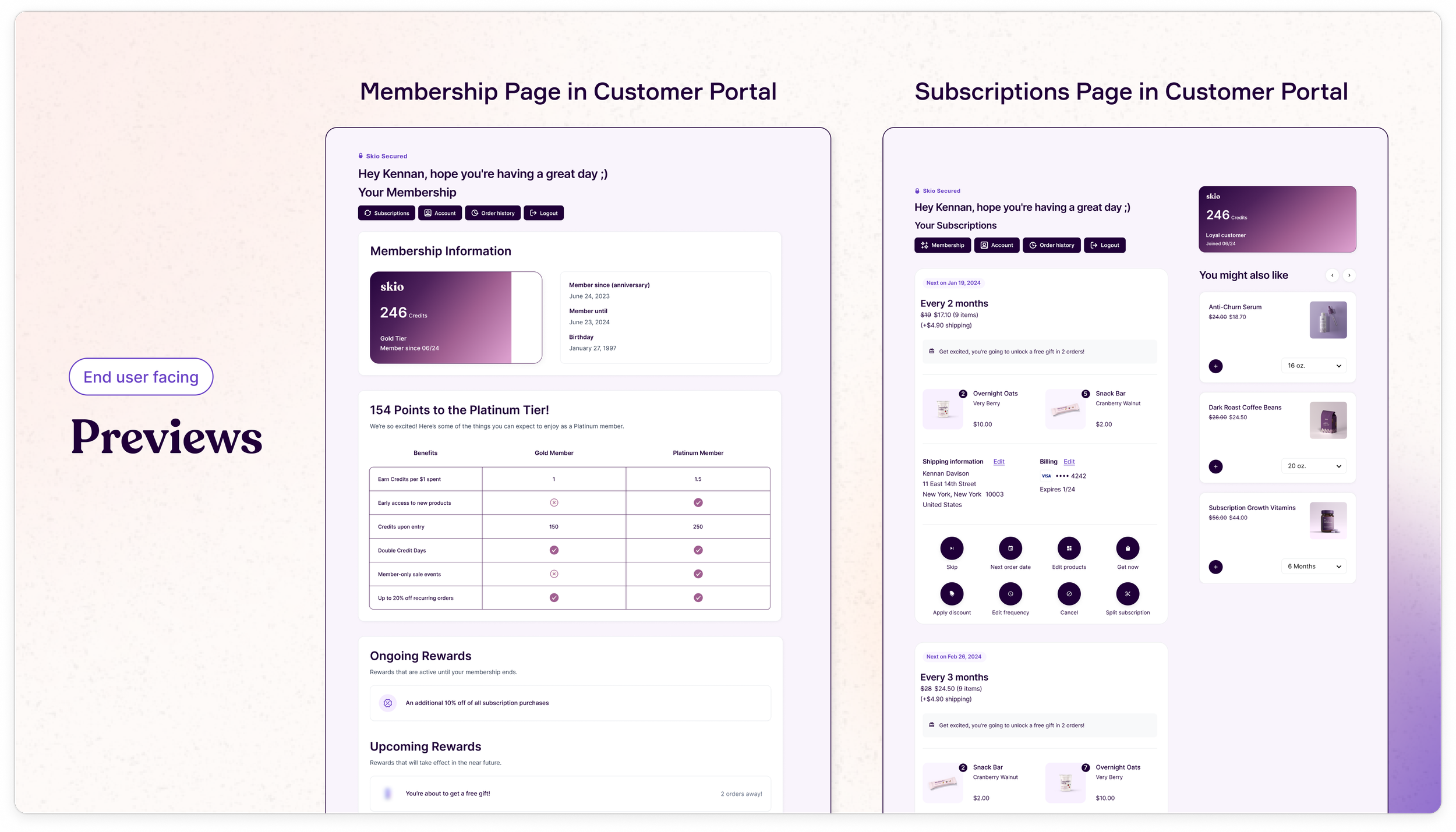
Final Previews
Here are some previews of key frames in the final flow!


Project Timeline

Research Insights
Leveraging insights from merchant calls and comprehensive market research, I identified three critical principles to drive my design strategy:
1 Versatility | The designs needed to be adaptable across various user scenarios, accommodating both logged-in and guest users, subscribers and one-time purchasers, as well as supporting multiple languages and currencies. This ensured the solution was inclusive and scalable.
2 Granularity with Simplicity | Merchants expressed a strong desire for detailed control in program setup.
My challenge was to deliver this granularity while maintaining an intuitive user experience, balancing complexity with ease of use.
3 Enhanced Visual Engagement | There was strong validation for increasing visual interactivity beyond basic reporting and data display. This reinforced the team’s initial direction, emphasizing the importance of creating a more engaging and visually compelling user experience.


User Flow Visualization
Given the extensive ecosystem spanning multiple platforms and touchpoints, I prioritized gaining a comprehensive understanding of each interaction flow. To illustrate this, I created a detailed flow map for the Tier Creation process, which visualizes the user experience across all stages.


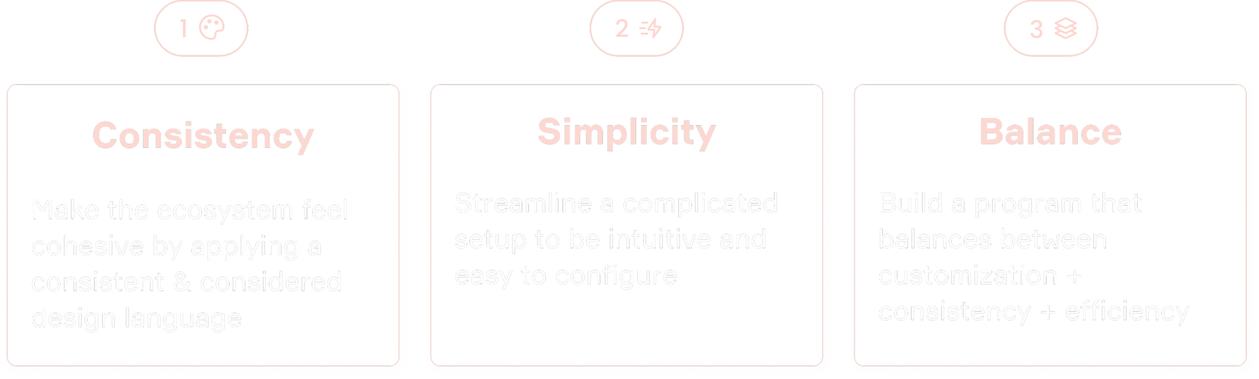
Design Goals
Building on the insights gathered from merchant calls and market research, I established key objectives to guide and validate my design process:
1 Establish cohesion through the details
Objective | Ensure consistency across all elements of the feature ecosystem.
Action | Meticulously aligned each component with our established design language, fostering a seamless and integrated user experience.
Impact | Created a harmonious interface that enhances brand recognition and user trust.
2 Build a natural user journey
Objective | Simplify complex setups into organic, user-friendly flows.
Action | Designed the user journey to transition smoothly, breaking down intricate processes into straightforward, intuitive steps.
Impact | Enhanced usability and reduced user friction, leading to higher engagement and satisfaction.
3 Find a balance between customization and efficiency
Objective | Achieve a optimal balance between customization, consistency, and operational efficiency.
Action | Developed flexible design elements that allow for extensive customization while maintaining consistency across merchant programs. Ensured the design supports efficient future enhancements and robust reporting capabilities.
Impact | Facilitated easy scalability and adaptability of the feature, enabling seamless updates and providing actionable metrics to validate feature benefits.
Outcome | These strategic goals ensured that my designs were not only visually cohesive and user-friendly but also scalable and data-driven. This approach enabled continuous improvement and provided measurable value to both users and stakeholders.

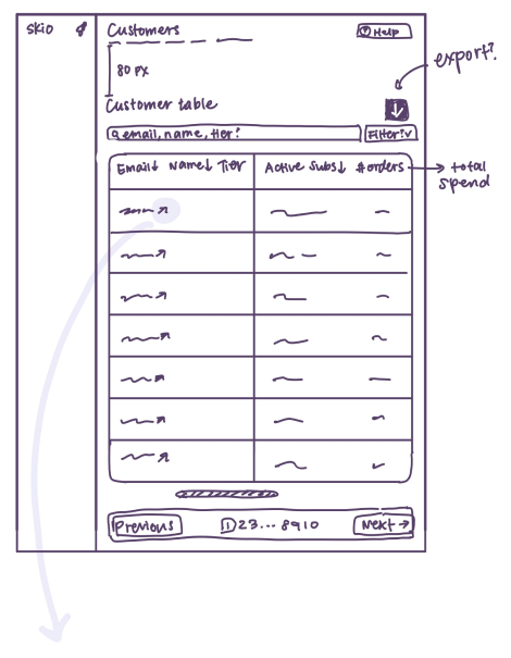
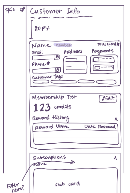
Lo-Fi Sketches
Here are a few examples of the initial low-fidelity sketches I made to conceptualize and explore potential layout options!


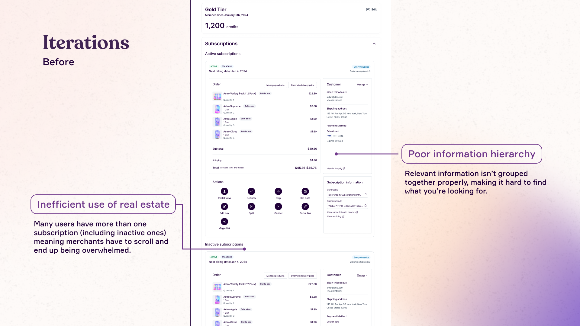
Iterations
This example showcases an iteration I made following further testing of the initial designs. The Customer Profile page allows users to view a customer’s active and inactive subscriptions. Due to time constraints, we initially opted to reuse an existing component from our Subscription Management dashboard. However, when transferred to this view, I felt that it resulted in information overload, poor content organization, and an inefficient use of visual real estate. Given that customers often have multiple subscriptions, this approach resulted in several unnecessary scrolls and made it hard to find the details you were searching for.
Through several rounds of iteration, I refined the design to address these issues. The final solution features a table with expandable rows, allowing users to focus on specific subscriptions while maintaining an overview of others. I enhanced visual clarity with larger images and a gray background to distinguish information blocks, contrasting with the full white background of the original version. Additionally, I incorporated a search bar and filters to make finding specific information faster and more intuitive.

Final Deliverable
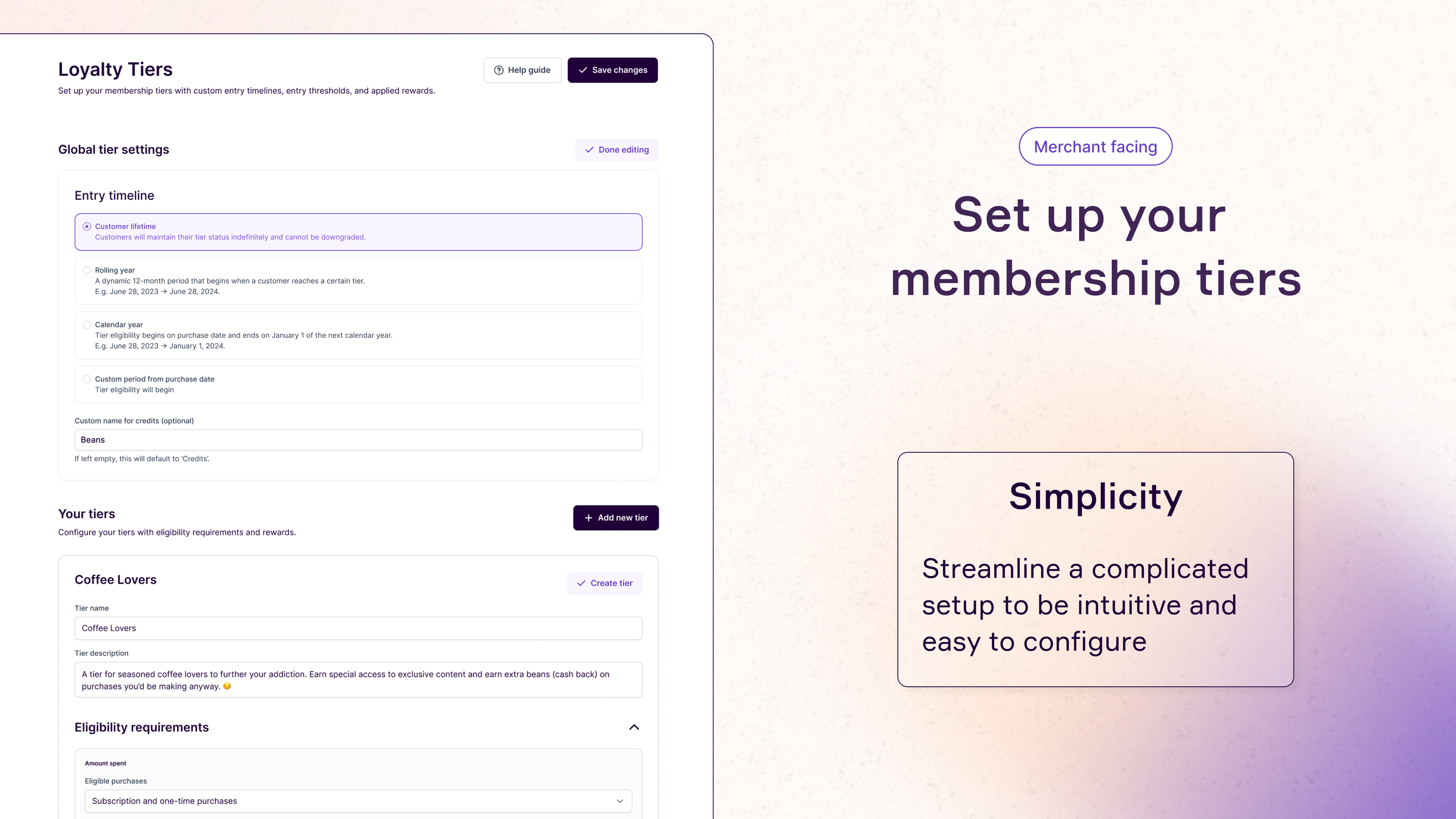
Imagine you're a merchant: you own an e-commerce business that's been gaining traction in the last few years and you recently launched a subscription program that's doing really well. You want to double down on this momentum by setting up a loyalty and memberships program. You come to Skio's dashboard and configure your tiers with conditional logic, tier-specific rewards, as well some global settings for all your tiers.

When you're done editing, everything collapses and summarizes the relevant key info.
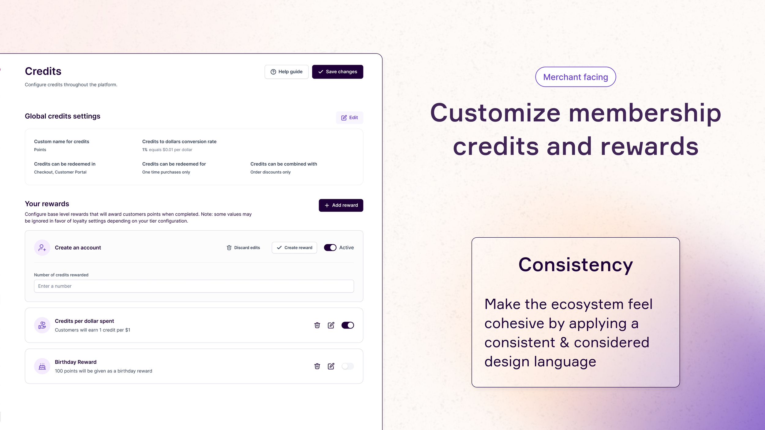
Now you want to set up some general settings for credits that complement the tiers you've set up.
Here, you can configure credit rewards to incentivize customers to take actions like signing up for your email newsletter or creating an account. You can also customize global settings for credits, for example how much 1 credit is worth in dollar value.

Now that your program is all set up, it's time to customize your memberships page to match your branding and website!
Each block has a few template options to choose from, and you can set your own colors, images, icons, and gradients for each while maintaining a cohesive layout and style.

Now that your program is live and customers are flooding into the different tiers, you get a few support tickets that require manual overrides for some customers.
You look up their email and manually change their tier, and maybe add some free credits in while you're at it.

As the customer, you receive notice that your membership status has been updated! You log into your portal to find that your tier has been upgraded from Silver to Gold, and you were gifted free credits.
You're pleasantly surprised and continue to scroll down to see what sort of benefits await you. You see that you have a free gift coming up, and feel intrigued by the blurred photo. You excitedly await your upcoming orders and look forward to your free gift.
Learnings
Final Words
Designing for consistency across multiple different platforms and interfaces.
This project underscored the critical importance of creating a unified design language that seamlessly adapts across diverse contexts—from mobile to desktop, and from merchants’ e-commerce sites to our product dashboard. I focused on developing a lean, reusable component system within our design framework, ensuring that visual and interaction patterns remained consistent across all platforms. This experience deepened my expertise in maintaining design coherence while addressing varying user needs and technical constraints, resulting in a polished and harmonious user experience across all touchpoints.
Compacting a lot of information into a clear, intuitive experience.
Throughout this project, I consistently balanced the need to present detailed content with the imperative for clarity. I was intentional in my design decisions, establishing a strong information hierarchy within each element of the user flow. By incorporating subtle visual cues—such as typographic emphasis, strategic spacing, and color contrasts—I aimed to guide users’ attention to key elements without overwhelming them. This experience refined my ability to deliver a streamlined, intuitive interface that supports users as they navigate complex flows.
Simultaneously managing different components of the project and thinking holistically throughout.
Managing simultaneous development of different ecosystem components presented unique challenges, particularly when changes in one component had cascading effects across the entire platform. This project allowed me to hone my ability to anticipate and safeguard against these changes during the design process, while also sharpening my adaptability and responsiveness to revisions. Tools like Figma’s Bulk Editing feature proved invaluable, enabling me to efficiently manage updates and maintain cohesion across all components.
As we approach the launch of this feature, I’m proud to have led such a pivotal project in Skio’s upcoming expansion. This experience rigorously tested my product thinking and design precision, from high-level strategy down to the finest details and pixels. Along the way, I honed my ability to balance user feedback with product constraints, refine and implement a lean design system, and manage the progress of multiple projects simultaneously. It’s been an incredibly rewarding journey, and I’m excited to see this feature come to life!